Another iTunes release, another widget kit: the iTunes 7 UI dissected.
You probably saw that iTunes 7 is out (now apparently dubbed the “iTunes Jukebox,” presumably to contrast it from the iTunes Music Store). If you’ve installed it, you know that the user interface has changed. Again. There are plenty of improvements (off the top of my head: inclusion of CoverFlow, gapless playback*), and reverse sync), but slopped atop all the new features is a thick coat of downright amateurish cosmetic adjustments.
By and large, iTunes seems to have been beaten with the same ugly stick that did such a number on Mail.app. (Oh, wait, I cribbed that line last year.) What’s different this time is that the stick must have been dipped in some of the Pro apps, and maybe iWork, before swinging around to hit the iTunes piñata again.
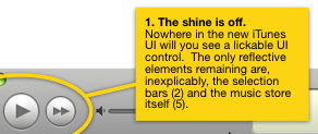
Therefore, let me present iTunes 7, Dissected: a catalog of all the inconsistencies, gripes, and irritations I experienced in the first ten minutes after upgrading.
high-res: PDF (mirror);
low-res: JPEG (mirror)
Make no mistake: I still love iTunes. I think that’s why these quirks grate on me so much—the rough edges on anything you really care about are particularly abrasive—and why I felt compelled to disgruntle myself.
Feel free to disgruntle yourself in the comments.
Update: Welcome, Linked List readers. (And, uh, yeah, I guess I am being a bit…er, vitriolic. I gripe because I care!)

