dsandler.org

Archive for September 12th, 2006

Other reviews of the iTunes 7 user interface are starting to roll in. Andy Matuschak says, simply, “What.” Rory Prior: a “death knell for Aqua”. Michael Tsai: “internally inconsistent and ugly”.

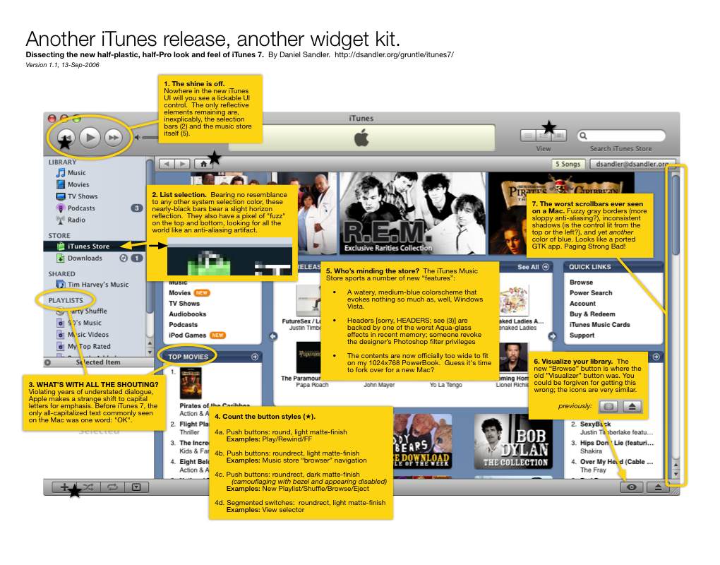
The benefit of waiting a few hours to chime in, I guess, is that you have time to carefully weigh your criticism and make it constructive. You know, instead of being all cranky and grumpy, like I was.

Update: David Chartier at TUAW has a series of articles walking through the new stuff in iTunes 7: big features, small features. Also, Dan Lurie seems pretty pleased about the demise of Aqua.

Update 2: Josh Buhler pokes a little harder at the scrollbars; Bruce Elgort appreciates the streamlined UI, once you get past the little issue of not knowing where your buttons are.

Update 3 (9/17): Daniel Wilson digs deep into color choices, interaction quirks, and lousy dialog button labels.

You probably saw that iTunes 7 is out (now apparently dubbed the “iTunes Jukebox,” presumably to contrast it from the iTunes Music Store). If you’ve installed it, you know that the user interface has changed. Again. There are plenty of improvements (off the top of my head: inclusion of CoverFlow, gapless playback*), and reverse sync), but slopped atop all the new features is a thick coat of downright amateurish cosmetic adjustments.

By and large, iTunes seems to have been beaten with the same ugly stick that did such a number on Mail.app. (Oh, wait, I cribbed that line last year.) What’s different this time is that the stick must have been dipped in some of the Pro apps, and maybe iWork, before swinging around to hit the iTunes piñata again.

Therefore, let me present iTunes 7, Dissected: a catalog of all the inconsistencies, gripes, and irritations I experienced in the first ten minutes after upgrading.

high-res: PDF (mirror); low-res: JPEG (mirror)

Make no mistake: I still love iTunes. I think that’s why these quirks grate on me so much—the rough edges on anything you really care about are particularly abrasive—and why I felt compelled to disgruntle myself.

Feel free to disgruntle yourself in the comments.

Update: Welcome, Linked List readers. (And, uh, yeah, I guess I am being a bit…er, vitriolic. I gripe because I care!)

from Cat and Girl: Famous Lady Victims

subscribe to dsandler.org

  •  
  • for faster updates, subscribe with FeedTree

mac software made on premises

toastycode.com: toasty software for the mac pyrotheque: a new (old) fireworks screensaver for the mac
Cuckoo—the bell tolls for your Mac.

twitter/dsandler [RSS]

    loading…

elsewhere

highlights

between the couch cushions

strongly connected

  • erinmak is not to be trifled with
  • pixelknave says moof when upside-down
  • dave is dangerous
  • rod is one groovy mother
  • adam is googling us all
  • amar is not really a pirate
  • angi sees little blue dots
  • harbinger lets you know it's coming
  • jason looks like an idiot in that hat
  • jeff is keeping austin weird
  • regan seems to tolerate jason
  • emann will not abide your IM-speak
  • jim is a stranger in ein anderes Land
  • liscio is pronounced "lee-show"
  • darryl has no need of identifying objects
  • friends as they appear on dsandler.org
  • sportsgirl reports…on all the pro courts

Search

Recent

Archives

dsandler.org is Dan Sandler's website and notebook.

Powered by WordPress and here's why.